
In this update to the Poppy wireframe kit, we have included buttons and inputs.
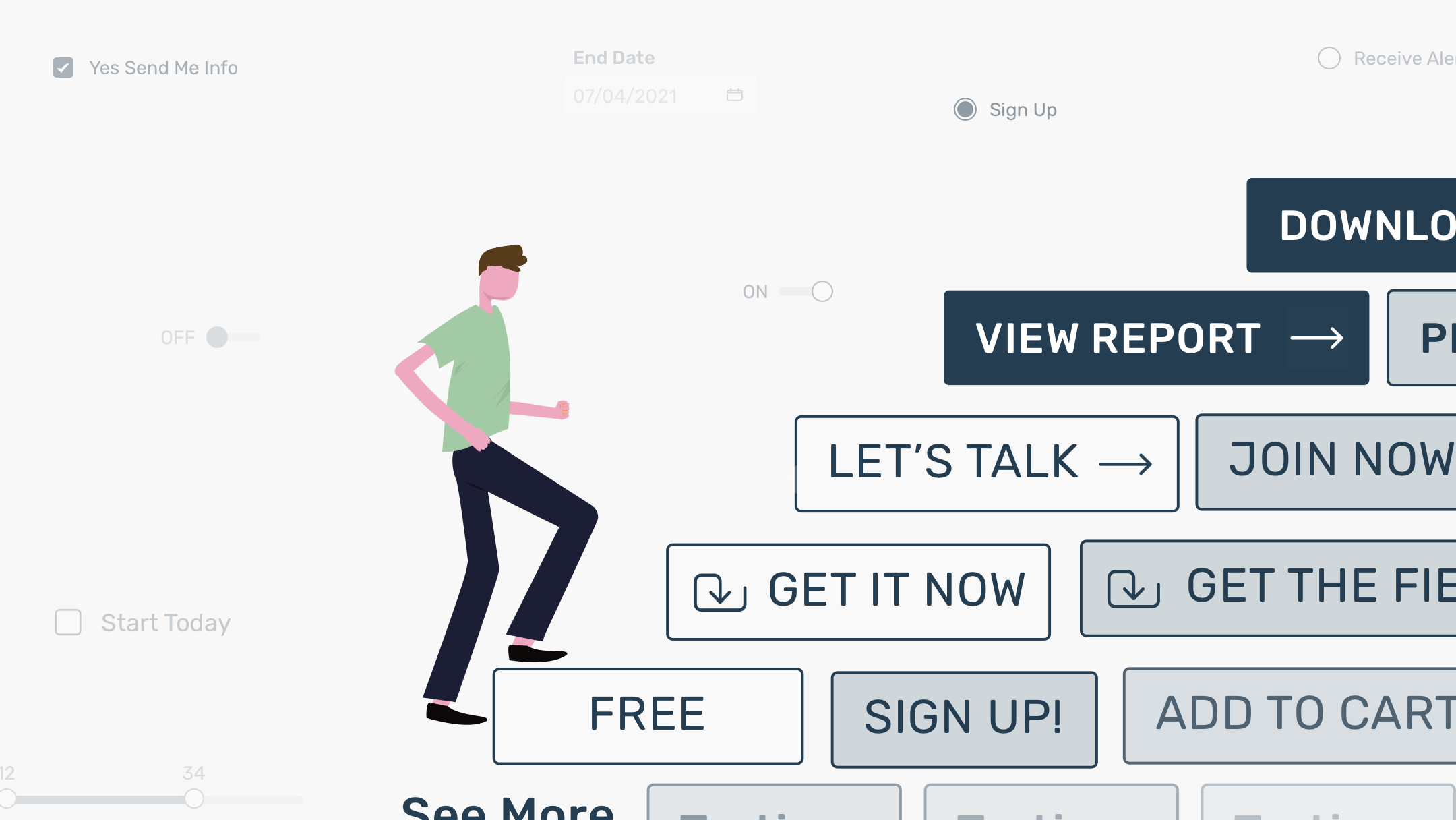
Buttons
As one of the key fundamental elements for human-computer interactions, your buttons even in a framework need to clearly look like buttons. They should be highly legible and obvious for your audience. That’s why when designing this set, for the Poppy system, we knew the buttons needed to be simple yet significant.
The most important actions should be the most visible. With that guideline, primary buttons carry the most visual weight with dark backgrounds and uppercase labels. This makes for a much easier read as well as easier to identify at a glance.
Secondary buttons share commonalities to the primary. While retaining the same shape with a clear outline, we have adjusted the visual weight using a lighter background fill. That way when it’s placed next to a primary button, it is clearly identifiable as the second read.
Sometimes you might need additional buttons. So we have also included a set of tertiary buttons in this kit. Visually they are much simpler than both primary and secondary buttons, which allows them to optimize visual hierarchy for all three types of buttons when they are placed next to each other.
If desired, you can include icons in your buttons to indicate the type of actions a user can expect. In this kit, we have built in such considerations for both primary and secondary buttons so you can have more flexibility and offer more visual cues when putting together your wireframe.
Inputs
In this update, you’ll also find elements for different types of inputs, from checkboxes to sliders, text input fields to date selectors. These are some of the most commonly used elements for forms on the web and digital products.
We advocate clarity in the Poppy system. For clear visual representation of human-computer interactions, both checked and unchecked statuses for checkboxes and radio buttons are available. To indicate ranges, you can use the range sliders and easily adjust the minimum and maximum values for your design.
Text input fields and select components are created with reference to the size and look of buttons and other elements in order to foster an orderly visual rhythm. When putting multiple fields together or being used alongside buttons, they can be easily aligned at their baselines and not overpowering each other.
For wireframes, sometimes it is important to communicate change of statuses based on user interactions. For that, we have also created the “in-focus” and “filled” states for input fields. A partial outline is used to visually show that the action of filling something in is in progress, while a full outline indicates the completion of such action. We also made sure all these states are visually different enough so that, in a glance, your design is able to quickly offer clear visual feedback to your audience. Stylistically, for visual thinkers, the partial-full-outline treatment is our subtle nod to the movement and energy Poppy presents.
__________
This is how we connect to the design community, and we hope you enjoy using this kit as much as we have enjoyed creating it. Stay tuned for more updates and additional resources to come. Happy wireframing and much success!


